

Neighborhood Climbing
Brand Identity
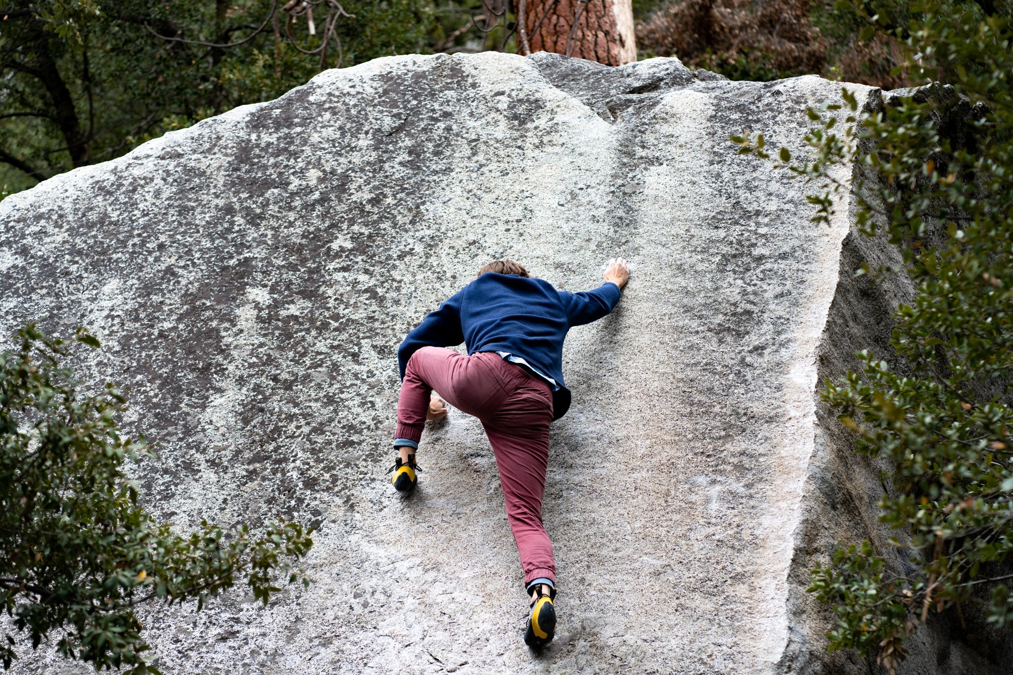
Neighborhood Climbing is a company that prioritizes precisely 2 things. Community and Climbing. They created a way to get more people involved in their community and keep on climbing. Through the company they organize events, created a social group that visits other gyms together, spend days up in Yosemite, or gets together around some food and and a movie. Their major goal for the company is to open up a gym in their hometown of Modesto, CA.
Being that community and climbing are the two major factors of the company, Neighborhood wanted a brand that felt welcoming and adventurous with a flexible design that would speak to a wide audience. They also wanted a design that was clean and ever so modern, while still feeling familiar.

Deliverables //
Logo Suite | Brand Guide | Website


THE FAMILY WE CHOOSE
Community History
The founders of Neighborhood all found each other in the local climbing gym in Modesto. Starting with a shared passion of rock and rope it was pretty easy to fall into a weekly groove, given that the gym was only open from 6PM-10PM on weeknights. This time constriction happened to be the best thing that could happen for them, everyone knew what time their friends would be at the gym.
When the gyms were all closed during the pandemic, the founders got resourceful. Home walls went up almost immediately. At first they were just for personal use due to social distancing, but once society opened back up so did the backyards. Soon enough they had a new problem, they couldn’t fit everyone who wanted to climb in the backyards anymore. Enter Neighborhood. The dream to start a gym was born, a new space where community and climbing could thrive together.
The Modesto climbing community is deep. The trip that get organized can range anywhere from 5-15 people and last anytime from 1 day to 2 weeks. Climbing happens weekly in multiple backyards with trips to other gyms happening daily. They’re a group that’s easily excited, and welcoming to boot.

A Flexible Logo
Homewalls and House Hangs
The logo started with an idea of familiarity and comfort. The client wanted something that would with multiple scenes and colors, so we opted for a logo that came in black and white to provide ample contrast. With Neighborhood being a company that deals in the outdoors and indoors we made a logo to visualize just that.
The lines that intersect the house are made to represent topographic lines. We also rounded all of the corners to soften the logo up a bit more and add a touch more refinement. And with the one of the companies goals being to grow community, a house became the obvious choice for a logo. Can’t have a neighborhood without any houses.


